

11 Jun What the Font?
Every good business knows attention to detail is what keeps you ahead of the playing field. We think to provide coffee for our employees to keep them energized, and to invest in better paper for our business cards so the receiving individual pauses to think how nice our card is.
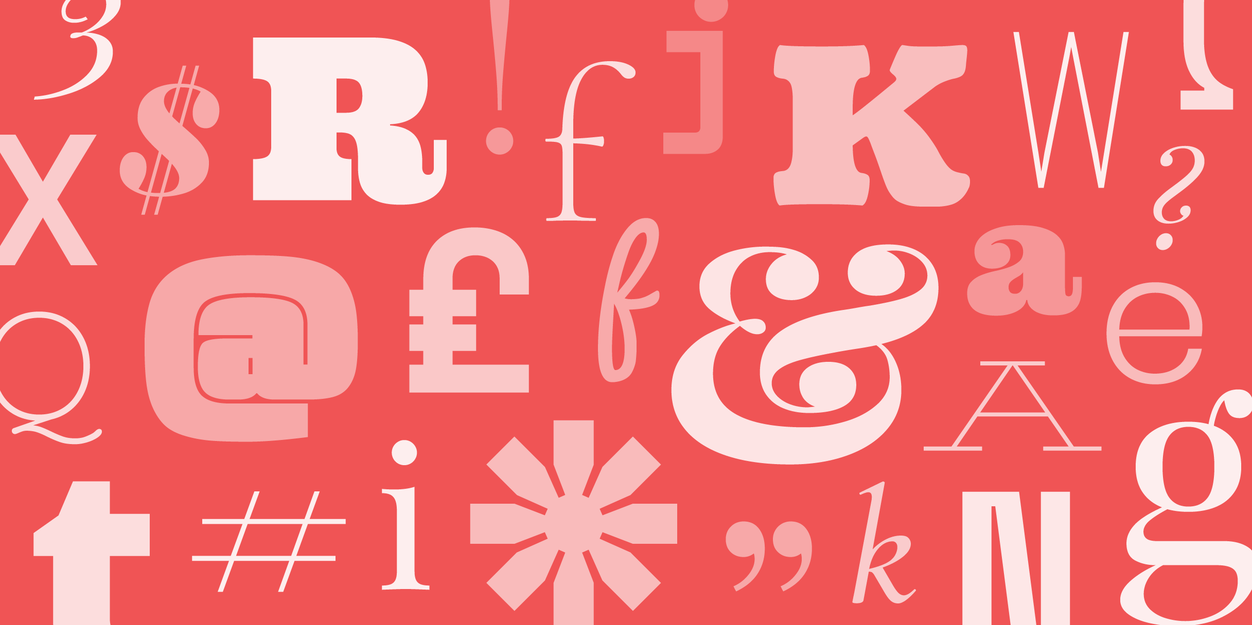
Another area to consider paying a little extra attention to is fonts. We are constantly surrounded by text. Street signs, advertisements, text messages from friend and family, documents, emails, the list goes on. Of course a generic font is common and perfectly acceptable to use, but when you’re the kind of person who likes to take things to the next level, consider a text with more flair. But be careful, as too much can be distracting.
To start, we’ll list the top “generic fonts”. Helvetica of course is the leading font in North America; it’s the font of Toyota, Target, and Apple, in addition to the choice for American tax forms, and NYC’s subway system. Then there’s Time New Roman- likely what you used throughout your education to submit papers. Calibri and Ariel round up the list as the usual default settings on most typing/writing software.
While a generic font is legible and clean-cut enough for just about everything, there are numerous other fonts with the same credentials, but unique enough to stand out. Our picks for the new normal of professional font are Old Standard, Quattrocento, and Forum (samples below). All three are nice, neat fonts that are easy to read, professional, but original enough for to warrant an “Oh, nice font” thought from whoever reads it.
There are hundreds, if not thousands, of fonts out there with more coming out every year. Perhaps you’ll find your own font to work for you. While you do want something unique to make your content standout, be careful not to pick something with too much flair or something too “swirly”. It can sometimes be hard to read, and convey a sense of unprofessionalism.
The definite font to avoid is Comic Sans. Unless you’re a comic artist, most people denounce Comic Sans as “the Nickleback of fonts”. It has such a strong public opinion, there’s even a website dedicated to encouraging people not to use it.
So in the interest of picking out a good, unique font for your business, try this. Take 5 minutes and type out your business name and a pangram (a sentence that contains every language of the alphabet IE. “The quick brown fox jumped over the lazy dog”) and try out several fonts to see which looks right for your brand and business.